Book design project
Printing details:
☞ Cover paper: Elements, fire, SRA3, 250gsm
☞ Inside pages: Elements, fire, SRA3, 100gsm
☞ Binding style: perfect binding
☞ Print finishes: cover of the book featured gold foiling of the title
☞ Cover paper: Elements, fire, SRA3, 250gsm
☞ Inside pages: Elements, fire, SRA3, 100gsm
☞ Binding style: perfect binding
☞ Print finishes: cover of the book featured gold foiling of the title
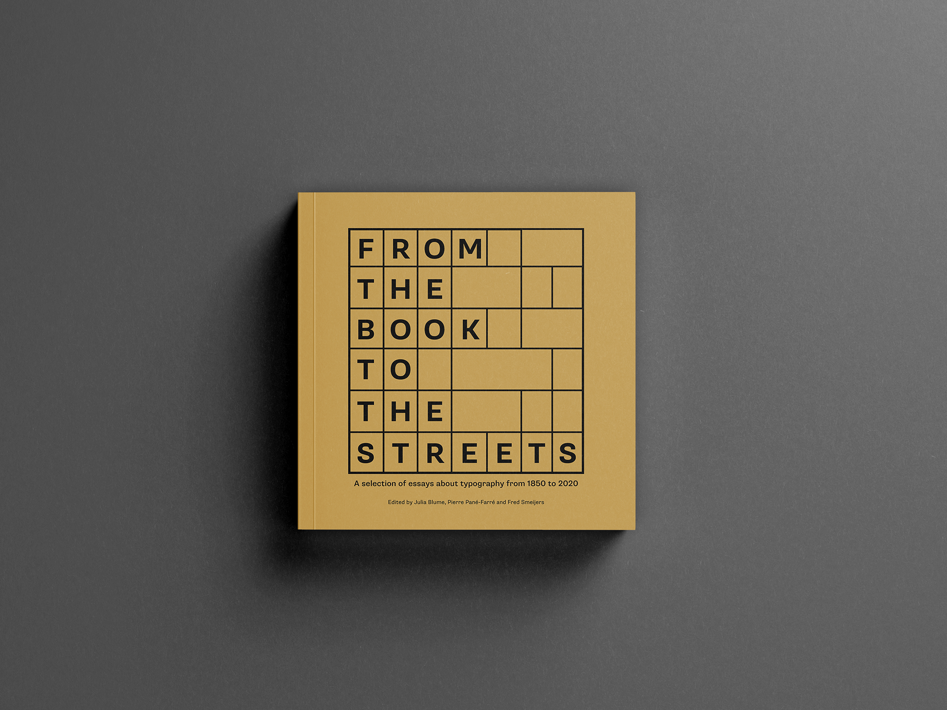
The brief of this editorial project required a contemporary and fresh book design based on the book written by academics ‘From the book to the streets: a collection of essays about typography in public spaces.’ This project focused on exploring the fundamentals of book design, crafting, and technologies. The project also had specific requirements to meet such as:
- designing two sample chapters and chapter openings
- a bibliography and contents page
- treatment of images
- prelims
- front and back cover
- 15mm spine
For the size of the book, I wanted to experiment with a harder format to design, selecting a
210 x 210mm square format (a selection of sizes were available in the brief to choose from).
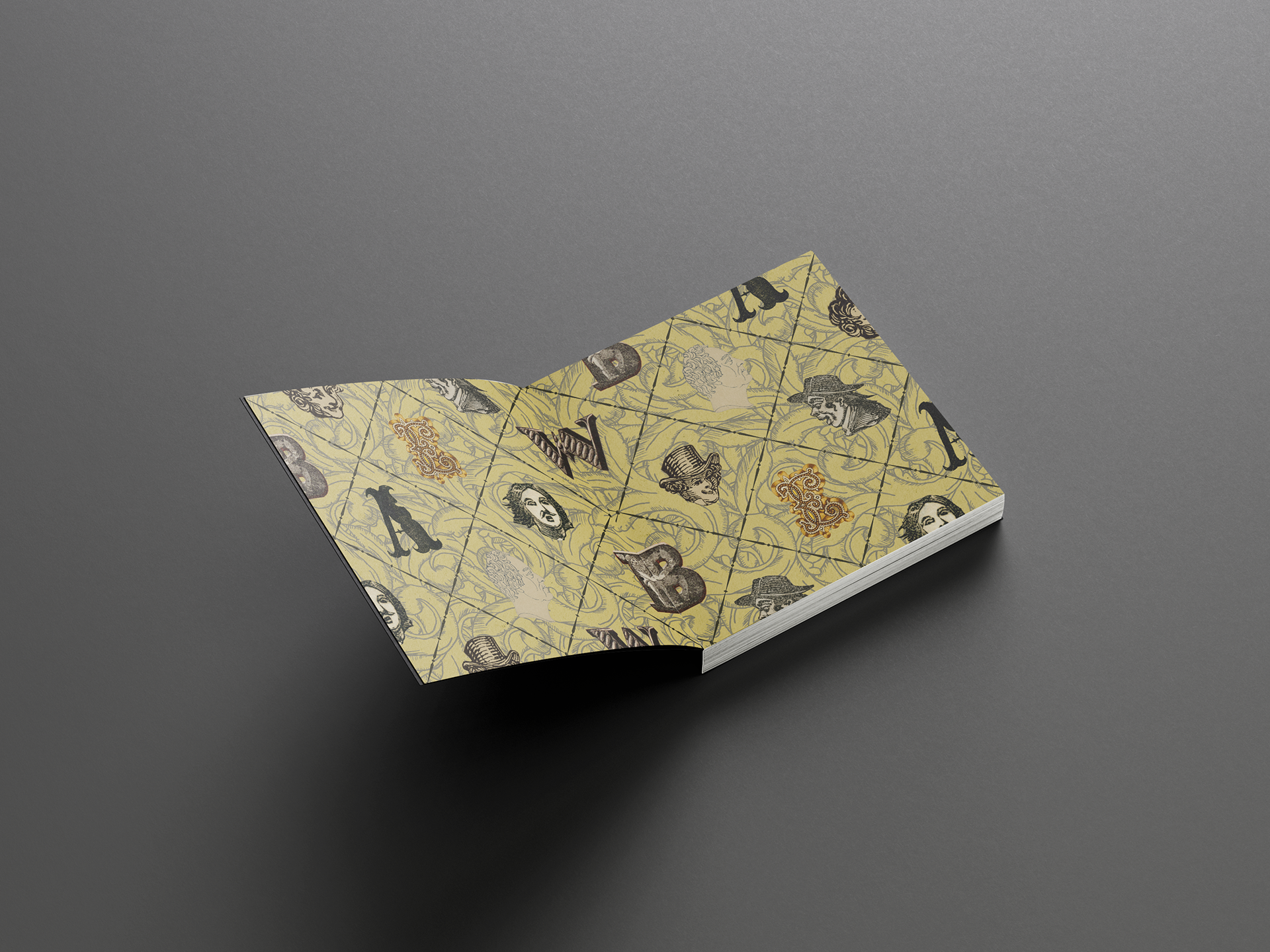
For the cover, I was inclined on keeping the design simple in nature, drawing inspiration from letterpress drawers to display the title, whilst also reflecting the contents of the book (which is discussing about typography).
One of the key things I wanted to set up before designing was a flexible grid that could allow a consistent approach to text and images likewise. I decided to use a 6-column grid with a baseline grid of 11pts and text size of 9pts. The typeface used for body text and footnotes is the Abril typeface family, since it has a contemporary and fresh look to it, whilst also being functional and comfortable to read in printed mediums. Image captions are set in a sans-serif typeface, called Supria Sans, to ensure that it is easily readable due to the smaller size of the captions.
- designing two sample chapters and chapter openings
- a bibliography and contents page
- treatment of images
- prelims
- front and back cover
- 15mm spine
For the size of the book, I wanted to experiment with a harder format to design, selecting a
210 x 210mm square format (a selection of sizes were available in the brief to choose from).
For the cover, I was inclined on keeping the design simple in nature, drawing inspiration from letterpress drawers to display the title, whilst also reflecting the contents of the book (which is discussing about typography).
One of the key things I wanted to set up before designing was a flexible grid that could allow a consistent approach to text and images likewise. I decided to use a 6-column grid with a baseline grid of 11pts and text size of 9pts. The typeface used for body text and footnotes is the Abril typeface family, since it has a contemporary and fresh look to it, whilst also being functional and comfortable to read in printed mediums. Image captions are set in a sans-serif typeface, called Supria Sans, to ensure that it is easily readable due to the smaller size of the captions.
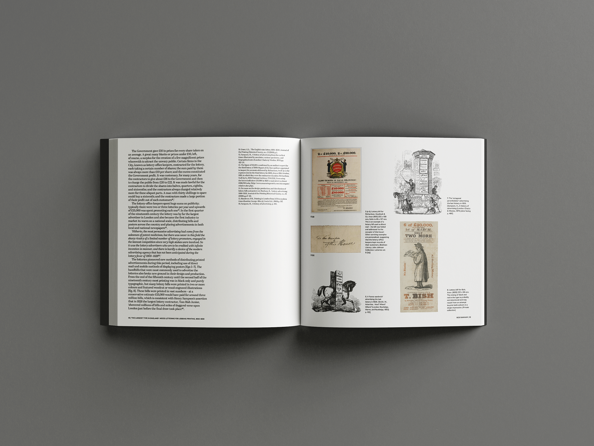

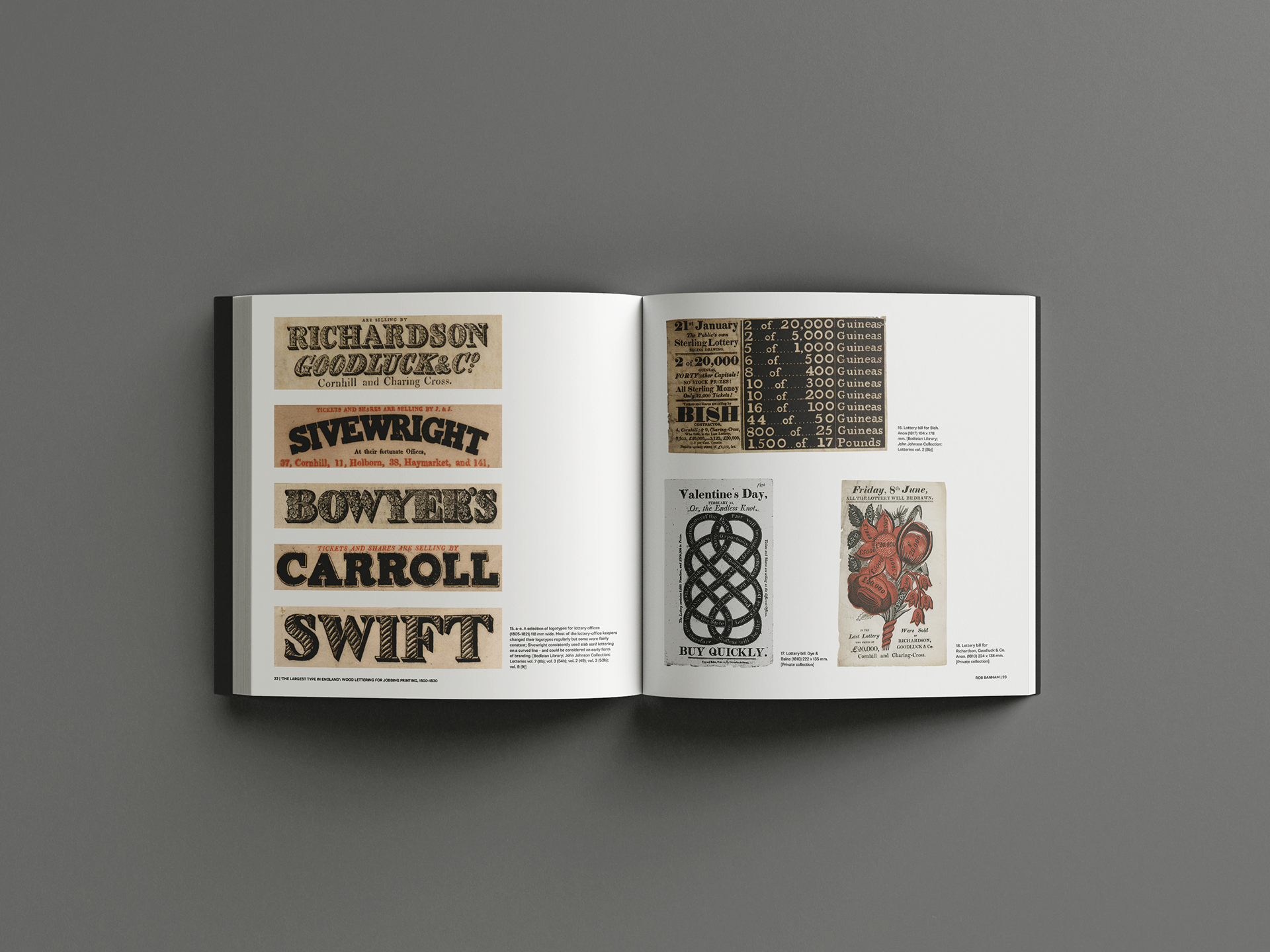
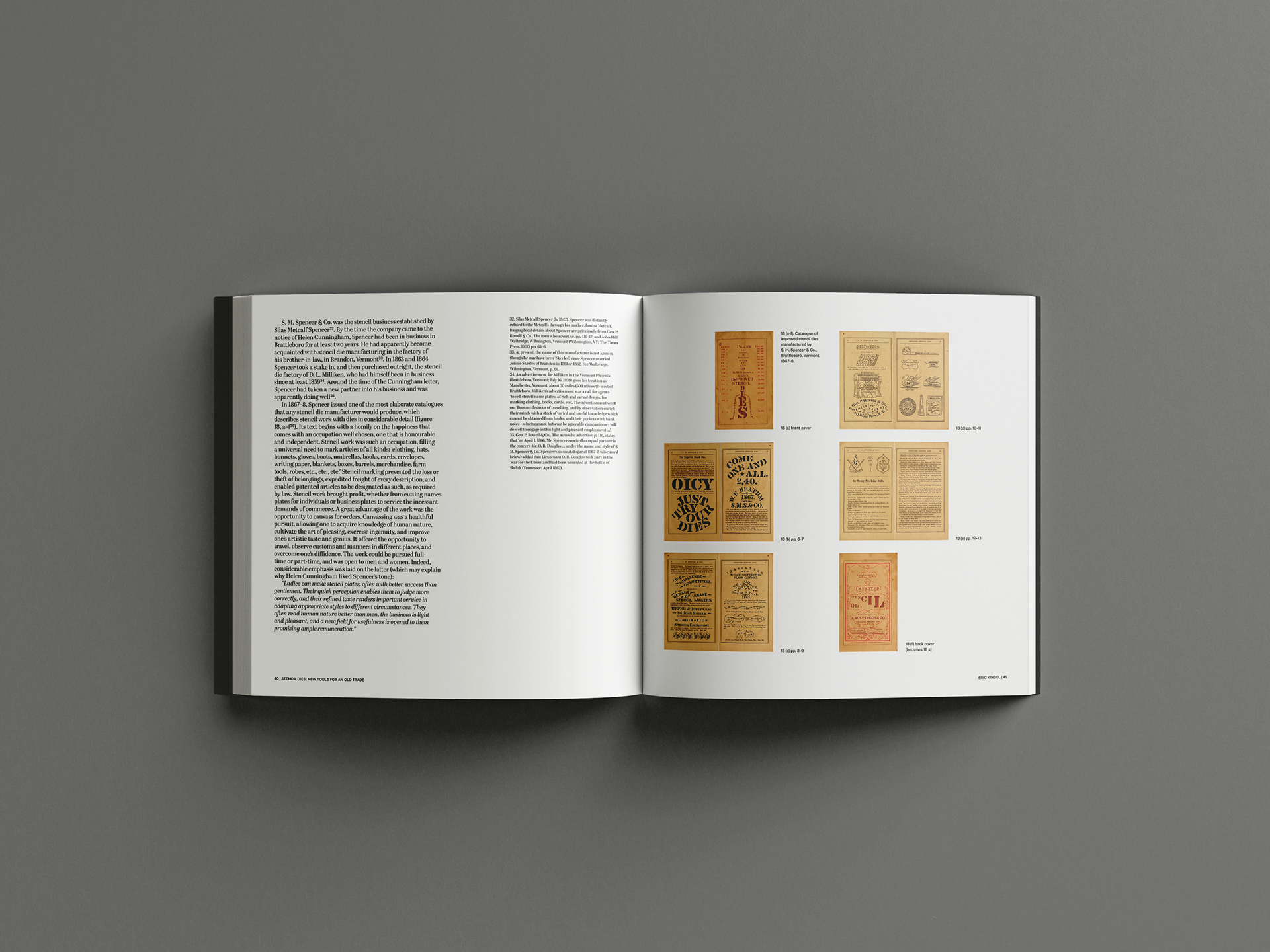
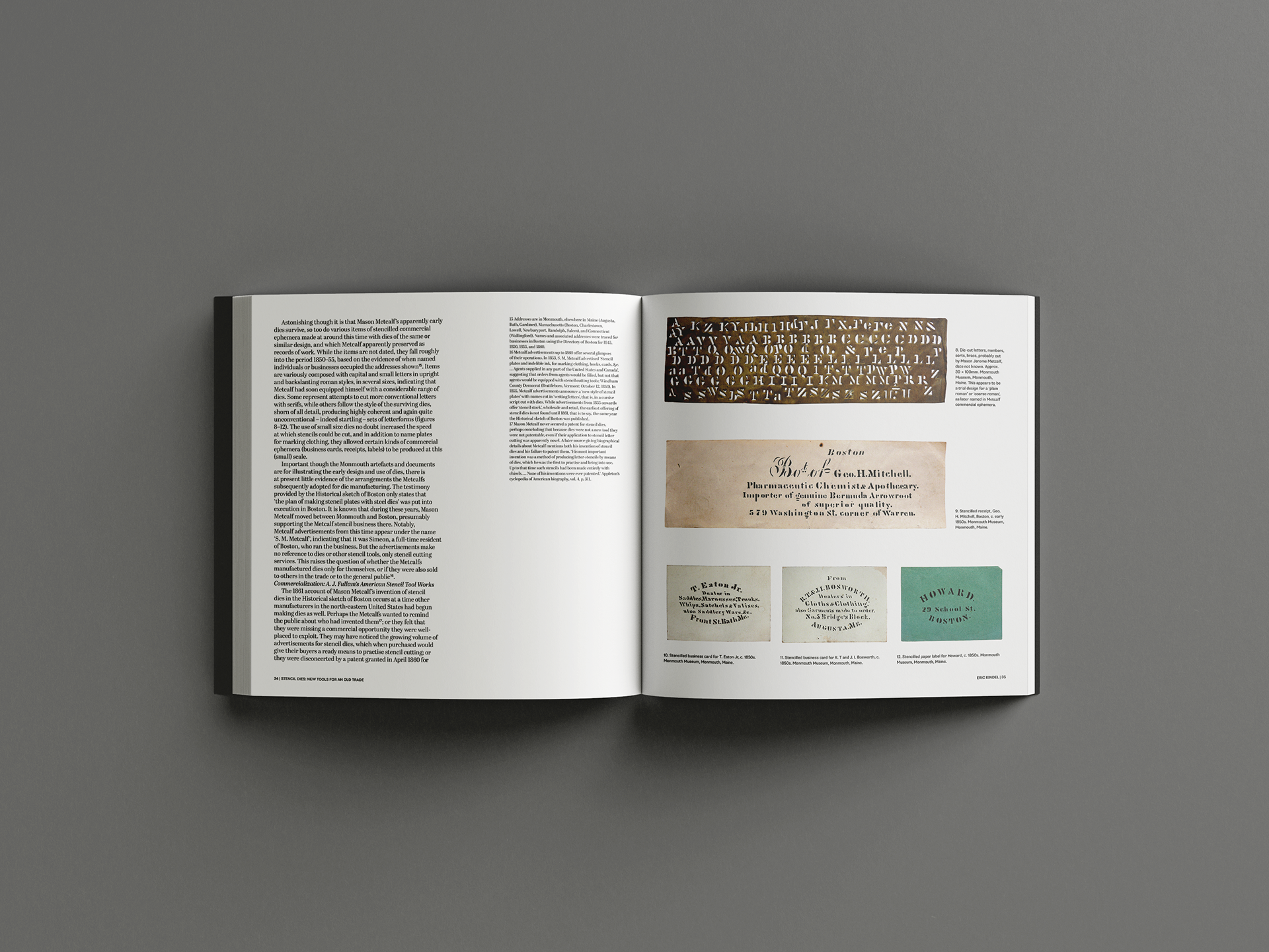
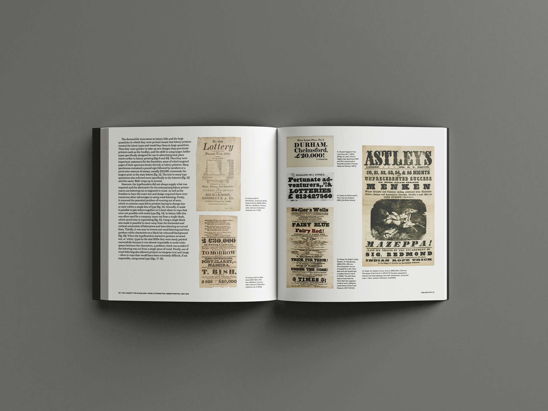
This project’s primary challenge to overcome was the handling of images with their respective captions, to make them look cohesive and as a set, since all images varied drastically in sizing. This meant creating some design systems and rules to follow throughout the design process to ensure consistency:
- the text box for captions should align with the bottom of the images
- images that are spread across two columns should have one column wide text box for the captions
- images that are horizontal, shown larger in scale or spread across two plus columns should have two column wide text box for the captions
The only two spreads where this system is broken are shown below, primarily due to the scale I decided to show the images in. For example, the spread on the right (second image), could have the two horizontal images (on the top right page, pg 35) reduced to a smaller scale to fit the captions across two columns, but in return would not have allowed the reader to examine the contents of the images effectively, since the complimenting text was discussing the details of those images.