
Diversity zine design project
Client: Rachel Warner, Department of Typography and Graphic Communication, UoR
Printing details
☞ Cover paper: printed 4/4 on 250gsm Edixion
☞ Inside pages: printed 4/4 on 120gsm Edixion
☞ No. of copies printed: 500
☞ Zine size: 168mm x 240mm
'I am, We are, Different by Design' is a student created and led zine, by the Department of Typography and Graphic Communication (TGC), created with the aim to inspire conversations around diversity and inclusion with the creative industry. This zine is not just limited to represent designers from the TGC department, but also showcase creatives from the entire The School of Arts and Communication Design, UoR.
I worked in a small team, with two other designers from the department, to produce issue 05 of the zine. After thorough brainstorming on potential topics to cover, I decided to focus on representing creatives from a South Asian background, to highlight the design and arts scene in South Asian communities. This meant, I was responsible for researching the creatives I wanted to feature, conducting interviews with them and copy editing, alongside designing the articles.
My individual design contributions to the zine were:
- inside front and back cover pages
- contents page
- 2 articles featuring South Asian designers


☞ Exploring South Asian identity in my design:
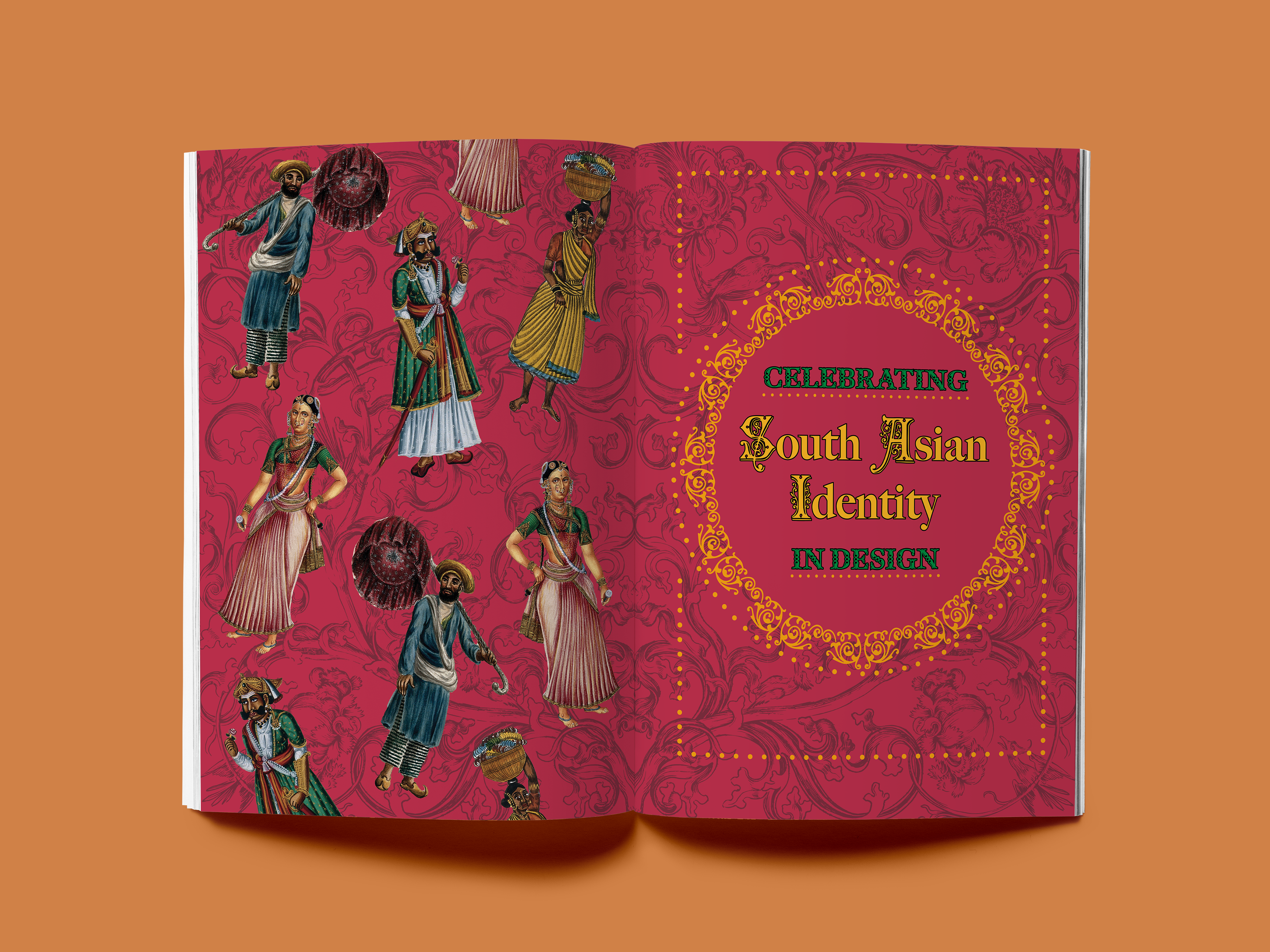
Asia is not only the world’s largest continent, but also one of the most diverse with thriving cultures. As a designer from South Asia, I was particularly interested in covering the South Asian region. South Asia predominantly consists of countries such as Bhutan, Bangladesh, India, Pakistan and Sri Lanka, with Afghanistan and Maldives often included in the region. South Asian communities have been rather underrepresented, especially in Western societies and we are slowly seeing an emergence in recognition.
‘Desigal’ was a magazine design project produced by a graduate student, Esha, from the Department of Typography and Graphic Communication, UoR. The independent magazine focuses on providing a flavour of fashion, beauty and entertainment, whilst celebrating diversity and inclusion amongst South Asians.
One of my primary goal was to include bright colours and patterns into the design of the interview. South Asia has a rich history of vibrant coloured dyes being used as early as 4000 BCE, made from plants such as turmeric, which I was interested portraying an aspect of it (refer image labelled 1 below).
In regards with adding patterns to my design, I focused on using dots, which are an important, base element that can be found in various Indian tribal art, mandalas, rangoli (an art form that focuses on creating patterns with vibrant coloured powders and sands), textiles, bindi’s (dotted mark/stickers placed on the forehead) and more (refer image labelled 2 below). I also experimented with other various floral inspired backgrounds at the initial development stage, but decided to not go with them further since it didn't feel particularly focused (refer image labelled 3 below).


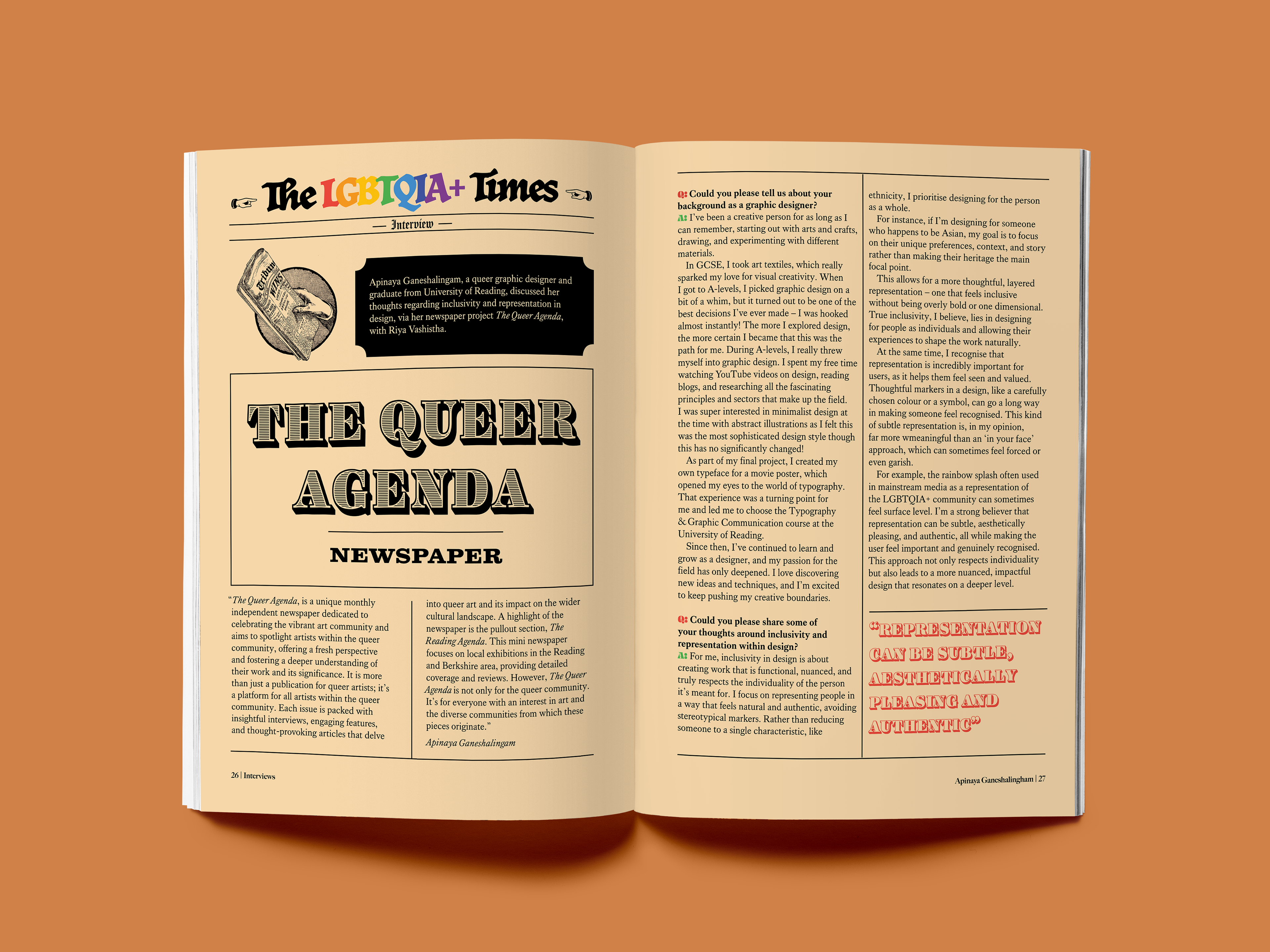
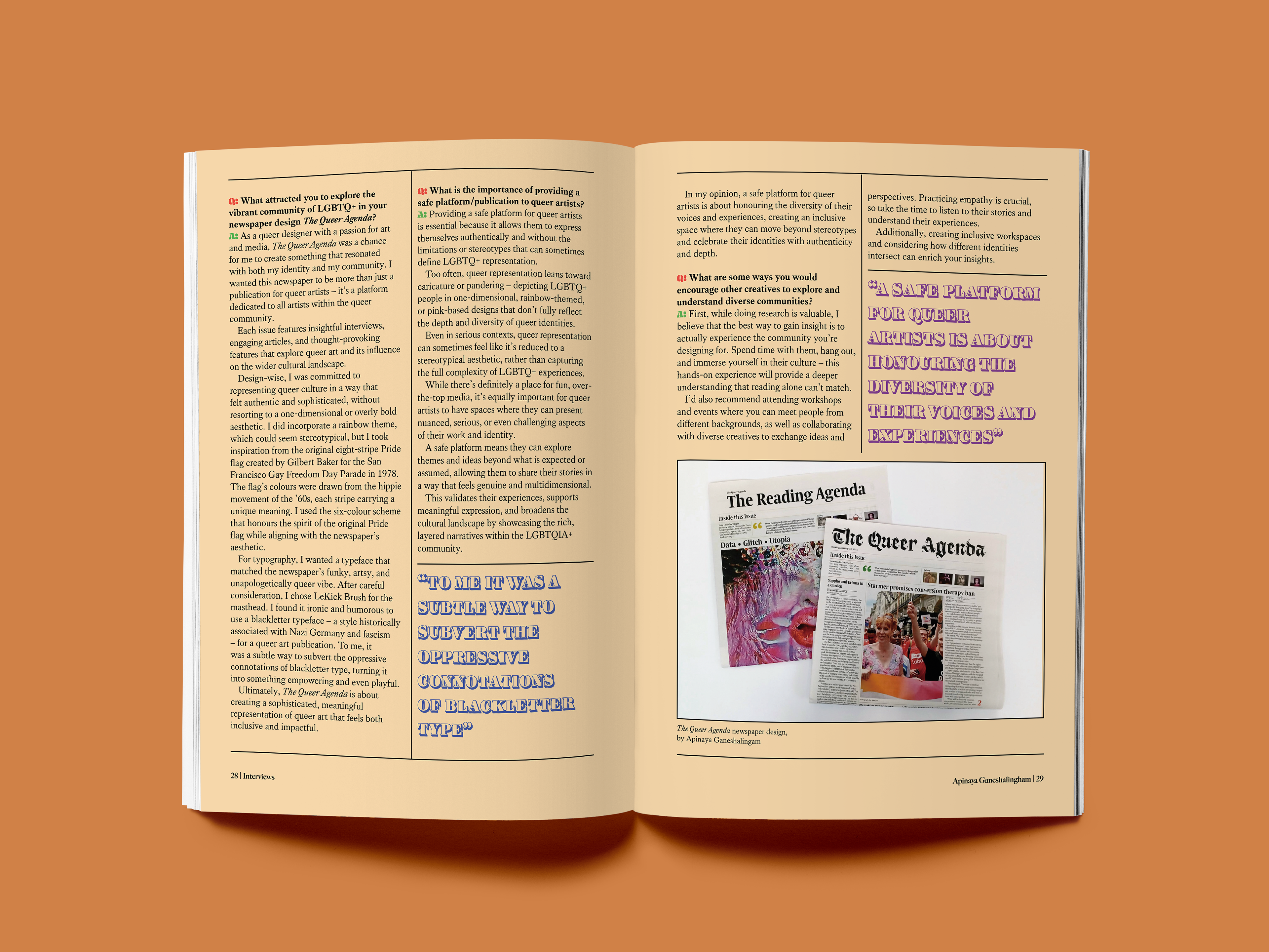
☞ Exploring queer representation in my design:
The queer community has always played a vital role in the development of arts and design by encouraging diverse representation, social activism, challenging notions and more.
‘The Queer Agenda’ is an independent newspaper design produced by a graduate student, Apinaya, from the Department of Typography and Graphic Communication, UoR. The newspaper focuses on celebrating the art and queer community, alongside providing challenging perspectives and engaging articles.
In regards with design of the interview, I wanted to base it on newspaper design with various columns, paired with hints of pride theming throughout to compliment the subtle and authentic representation design approach Apinaya took with her newspaper (which was subtle pride representation). Hints of pastel-like pride colours can be seen in the title of the article, alongside with pull-out quotes alternating with individual pride colours (refer image labelled 4 below).
