Narrative Booklet design project
Printing details:
☞ Paper: Olin soft white SRA3, 100gsm
☞ Binding style: saddle stitch
☞ Booklet size: 123mm (w) x 210mm (h)
The brief of this booklet design project required to explore, understand and develop awareness of the relationship between words and images in graphic communication, specifically in a narrative, graphic sequence. The project also focused on exploring different visual compositions, within the umbrella of typo/graphic deisgn, and how texts can communicate.
The intial idea of this topic, for me, stemmed from the desire to explore colonial India, alongside the various tragedies India suffered during its almost 200 years of colonialism under the British Empire.
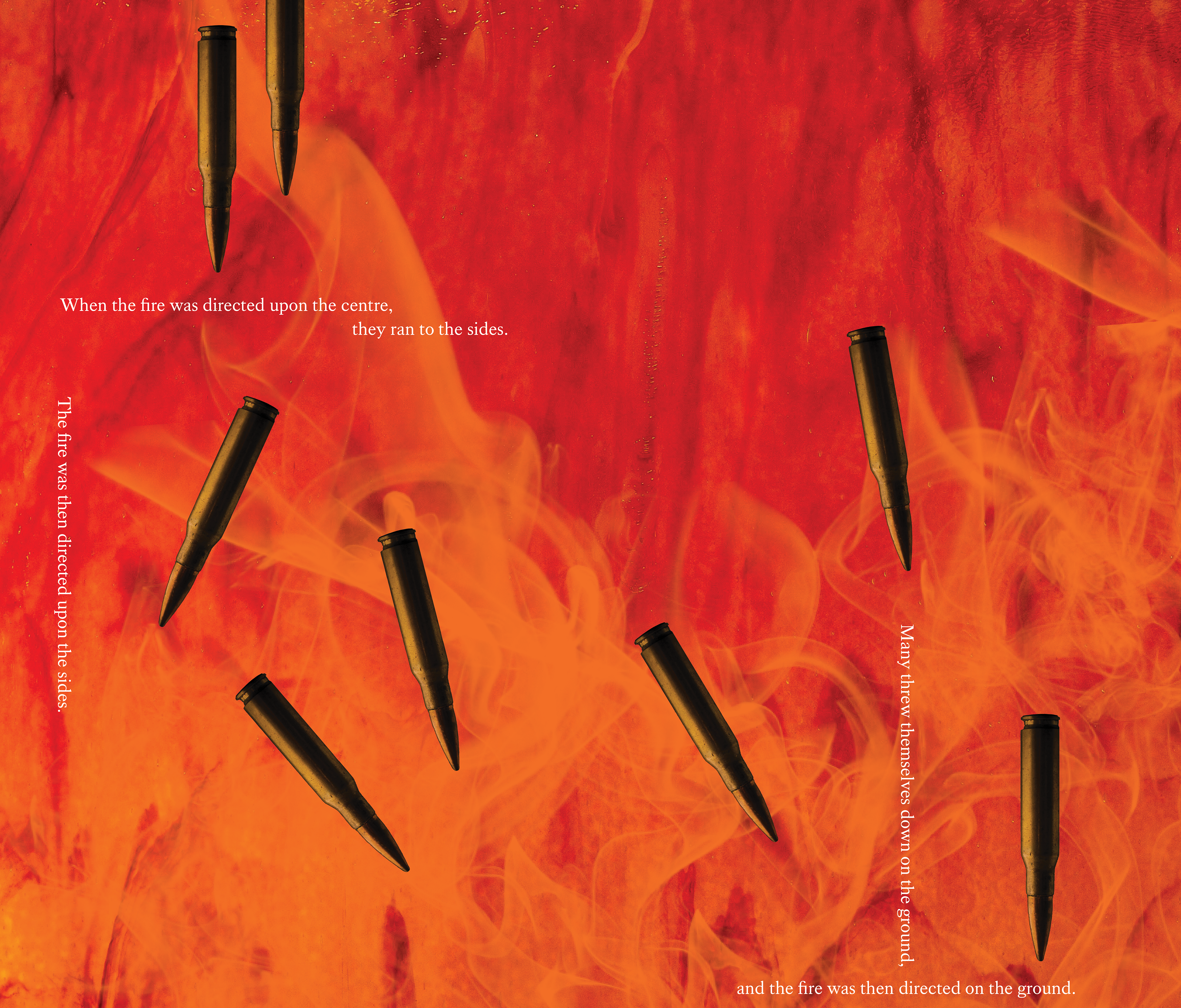
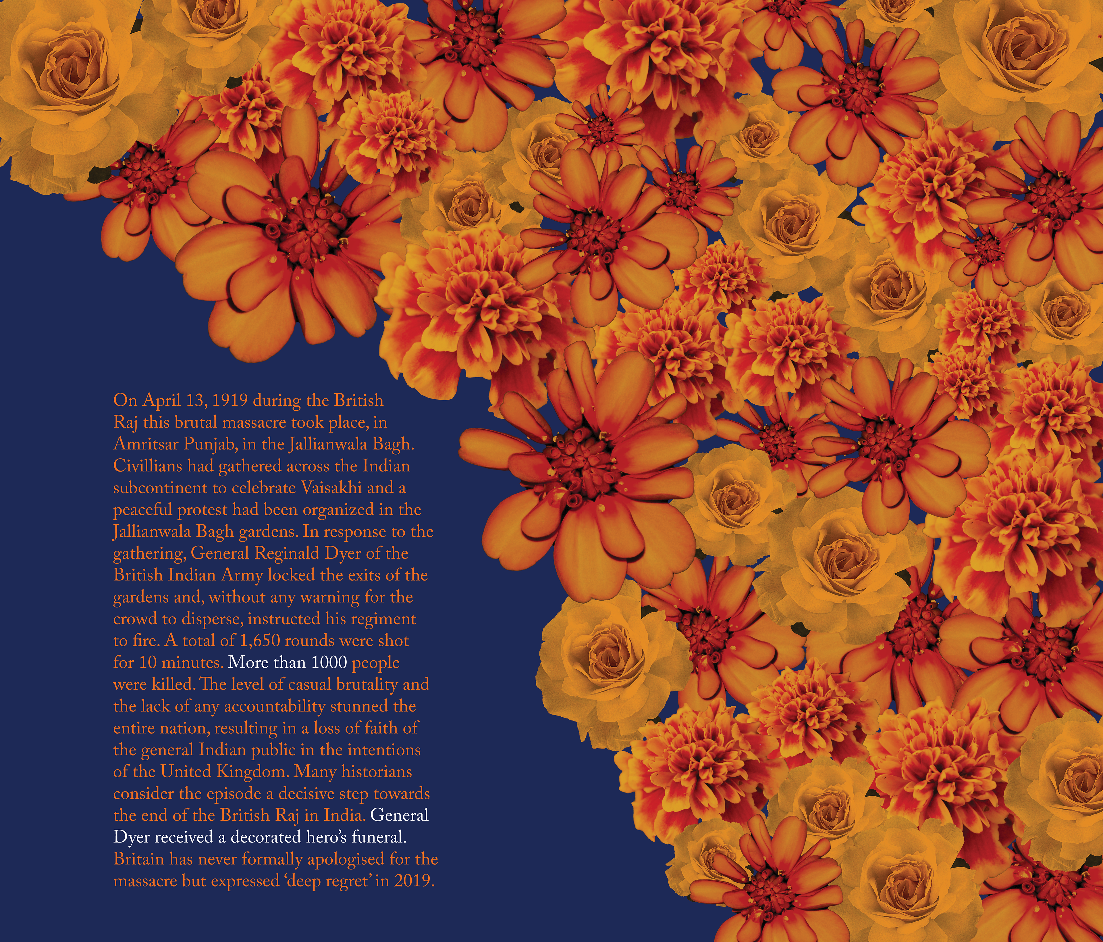
The Jallianwala Bagh massacre took place on April 13, 1919, in Amritsar, Punjab, which resulted in more than 1000+ people dying. Innocent civilians had gathered across the Indian subcontinent to celebrate a Sikh festival, Vaisakhi, in a garden before being ambushed by General Dyer’s armed troops. General Dyer had blocked the exits of the gardens, before commencing the fire without any warning to disperse the crowd. A total of 1,650 rounds were shot for 10 minutes, until their ammunition reached a point of exhaustion.
Various themes such as brutality, confinement, power etc have been explored in a subtler style, so that the visuals do not overpower the texts, as I was predominantly interested in exploring the effects of texts on their own.
The booklet focuses primarily on the following:
- colour sequencing and pacing: each spreads’ colours are a reference to either the festival of Vaisakhi or flags of both countries, helping create visual pacing
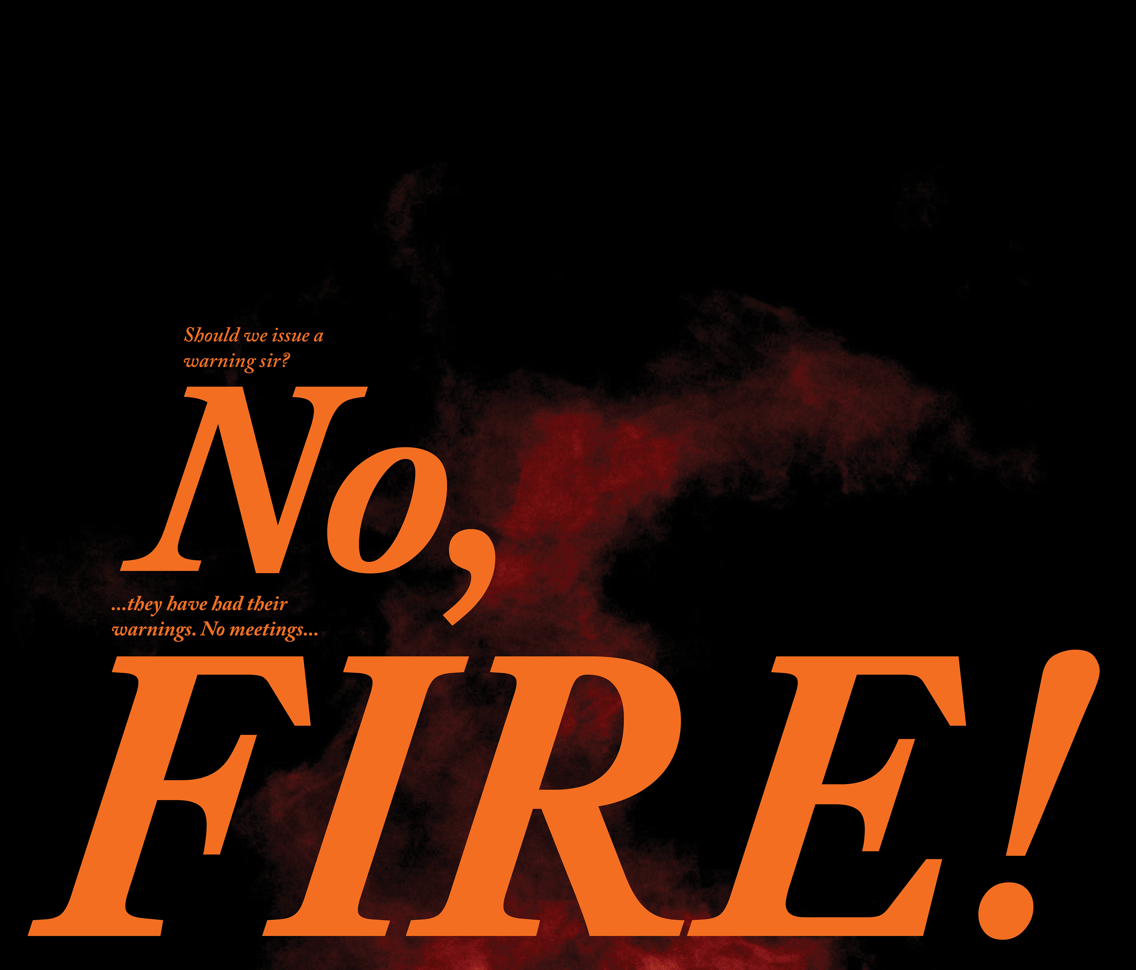
- symmetry of texts and graphical elements: each spread has text and/or image alignment that is symmetrical to a different spread. For example, spread 1 features flowers, which is mirrored in spread 7. Spread 2 features narrow text aligning with the bars and spread 6 mirrors the same narrow text. The words 'no' and 'fire' in spread 3 are large, to represent firm order and spread 5 follows the same rule of symmetry, except it is with the words 'no' and 'more.'
- symbolic imagery: various symbolic imagery such as emblems, flowers, etc. can be found throughout, some more subtle than others.
- text sizes: words are a powerful tool, and I wanted to explore the effects of both smaller and larger scaled text sizes, each creating an impact of their own, while also complimenting the contents of the texts. For example, in spread 3, the enlarged words 'no' and 'fire' draw the readers attention immediately, encouraging them to read the finer text in return. This also worked rather well considering if the reader was skim reading and did not want to read the finer text, the enlarged words worked as statements that helped progress the narrative ahead, so the readers were not particularly missing out on the narrative.
Please feel free to click the button below to view my detailed workings and explorations of this complex narrative project!
- colour sequencing and pacing: each spreads’ colours are a reference to either the festival of Vaisakhi or flags of both countries, helping create visual pacing
- symmetry of texts and graphical elements: each spread has text and/or image alignment that is symmetrical to a different spread. For example, spread 1 features flowers, which is mirrored in spread 7. Spread 2 features narrow text aligning with the bars and spread 6 mirrors the same narrow text. The words 'no' and 'fire' in spread 3 are large, to represent firm order and spread 5 follows the same rule of symmetry, except it is with the words 'no' and 'more.'
- symbolic imagery: various symbolic imagery such as emblems, flowers, etc. can be found throughout, some more subtle than others.
- text sizes: words are a powerful tool, and I wanted to explore the effects of both smaller and larger scaled text sizes, each creating an impact of their own, while also complimenting the contents of the texts. For example, in spread 3, the enlarged words 'no' and 'fire' draw the readers attention immediately, encouraging them to read the finer text in return. This also worked rather well considering if the reader was skim reading and did not want to read the finer text, the enlarged words worked as statements that helped progress the narrative ahead, so the readers were not particularly missing out on the narrative.
Please feel free to click the button below to view my detailed workings and explorations of this complex narrative project!