Independant magazine design project
Printing details
☞ Cover paper: Olin, soft white, 250gsm
☞ Inside pages: Olin, soft white, 100gsm
☞ Binding style: buttonhole stitch
☞ Binding thread: 0.8mm waxed thread in the colour red
☞ Cover paper: Olin, soft white, 250gsm
☞ Inside pages: Olin, soft white, 100gsm
☞ Binding style: buttonhole stitch
☞ Binding thread: 0.8mm waxed thread in the colour red
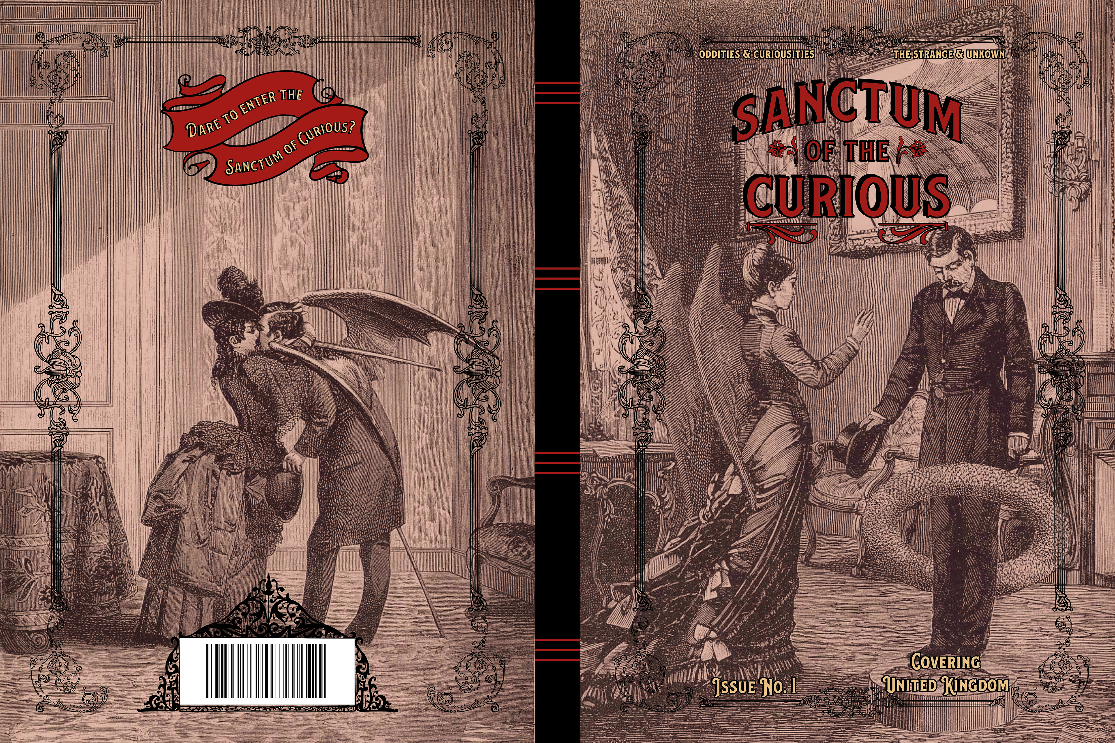
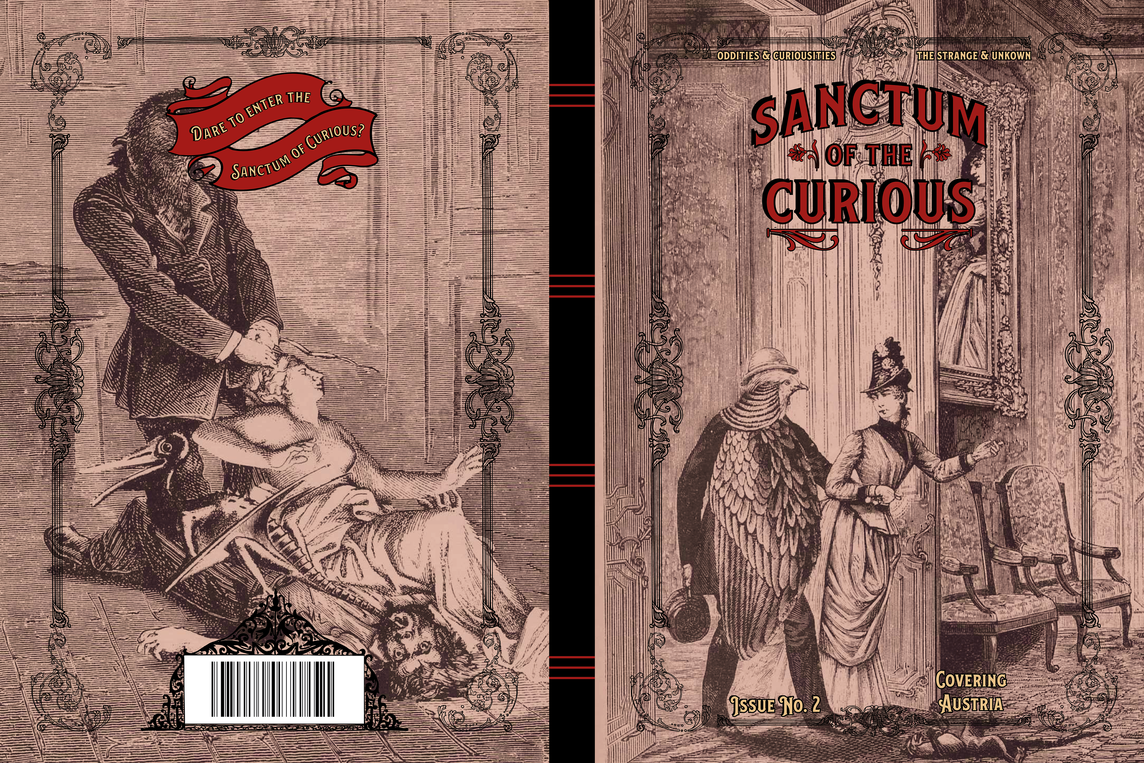
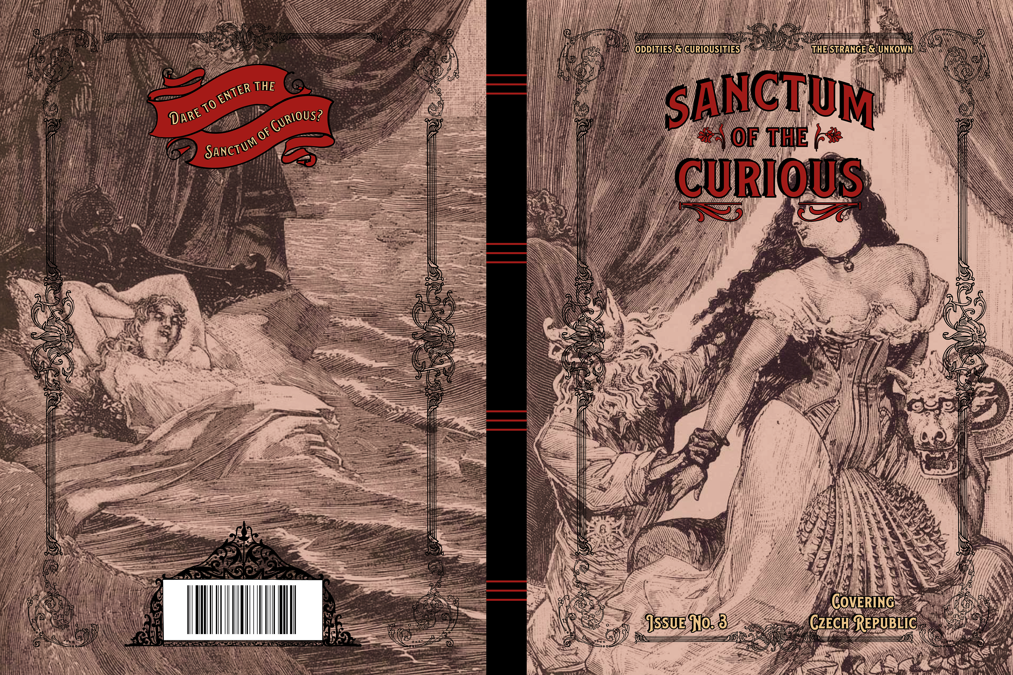
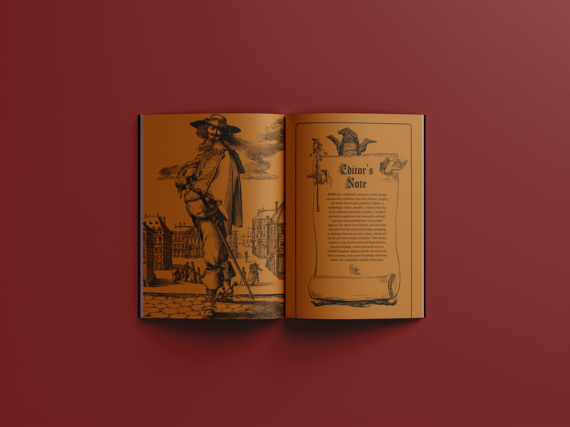
Sanctum of the Curious is a biannual, independant magazine, revolving around all things occult, oddities and curiosities, exploring unique (or strange) practices, rituals, mythology, beliefs and superstitions. Each edition focuses on different parts of the world and/or countries, diving in the strange traditions that took/take place, alongside exploring hidden parts of various cultures. This magazine caters to people who are interested in such curiosities and would like to explore different mystiques around the world.
The brief of this project had various requirements to fulfill such as an editor’s note, listing, contents page and an interview, whilst covering an aspect of visual culture. The project also required to showcase alternative cover designs that worked together as a continuous series.
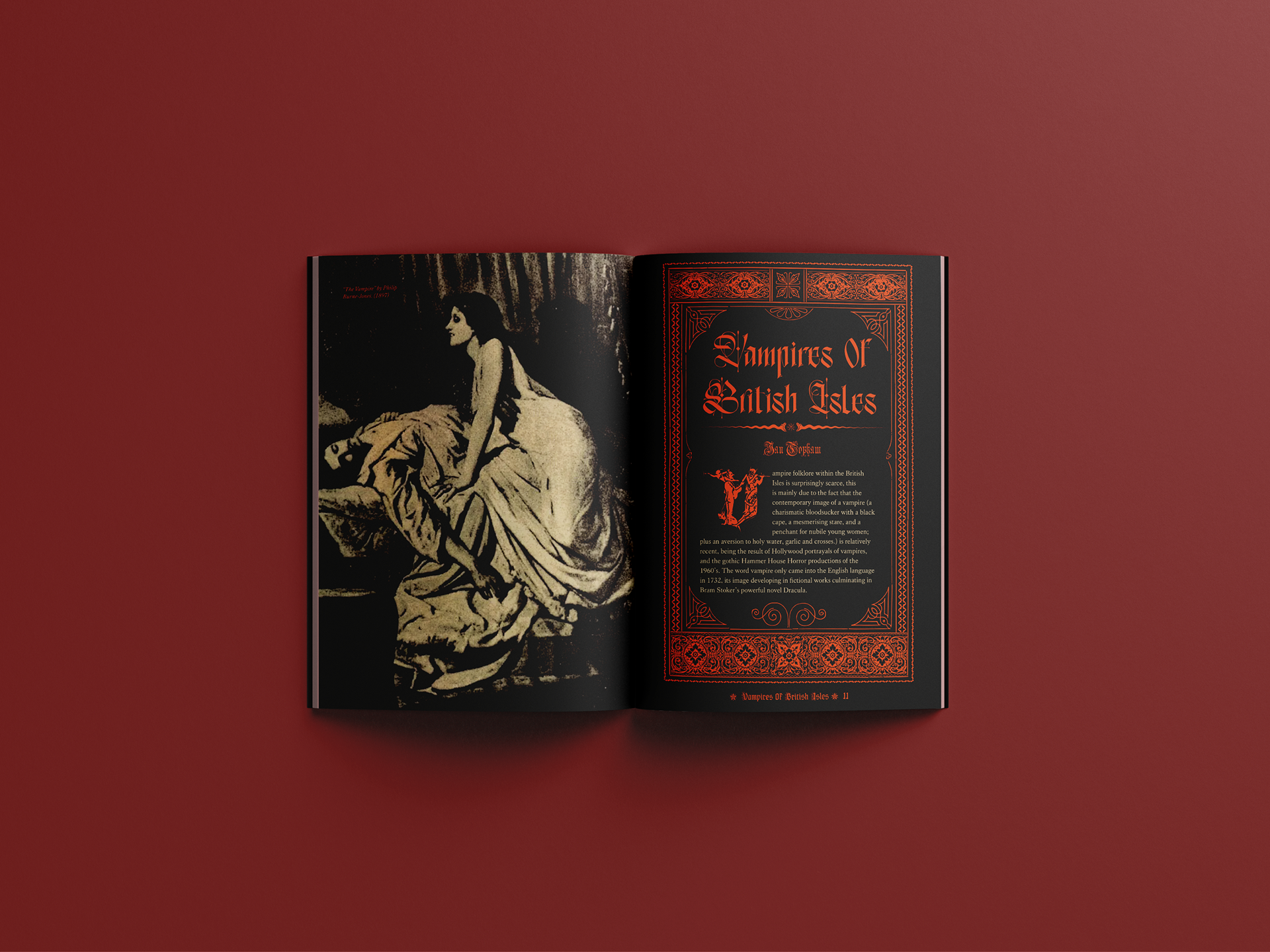
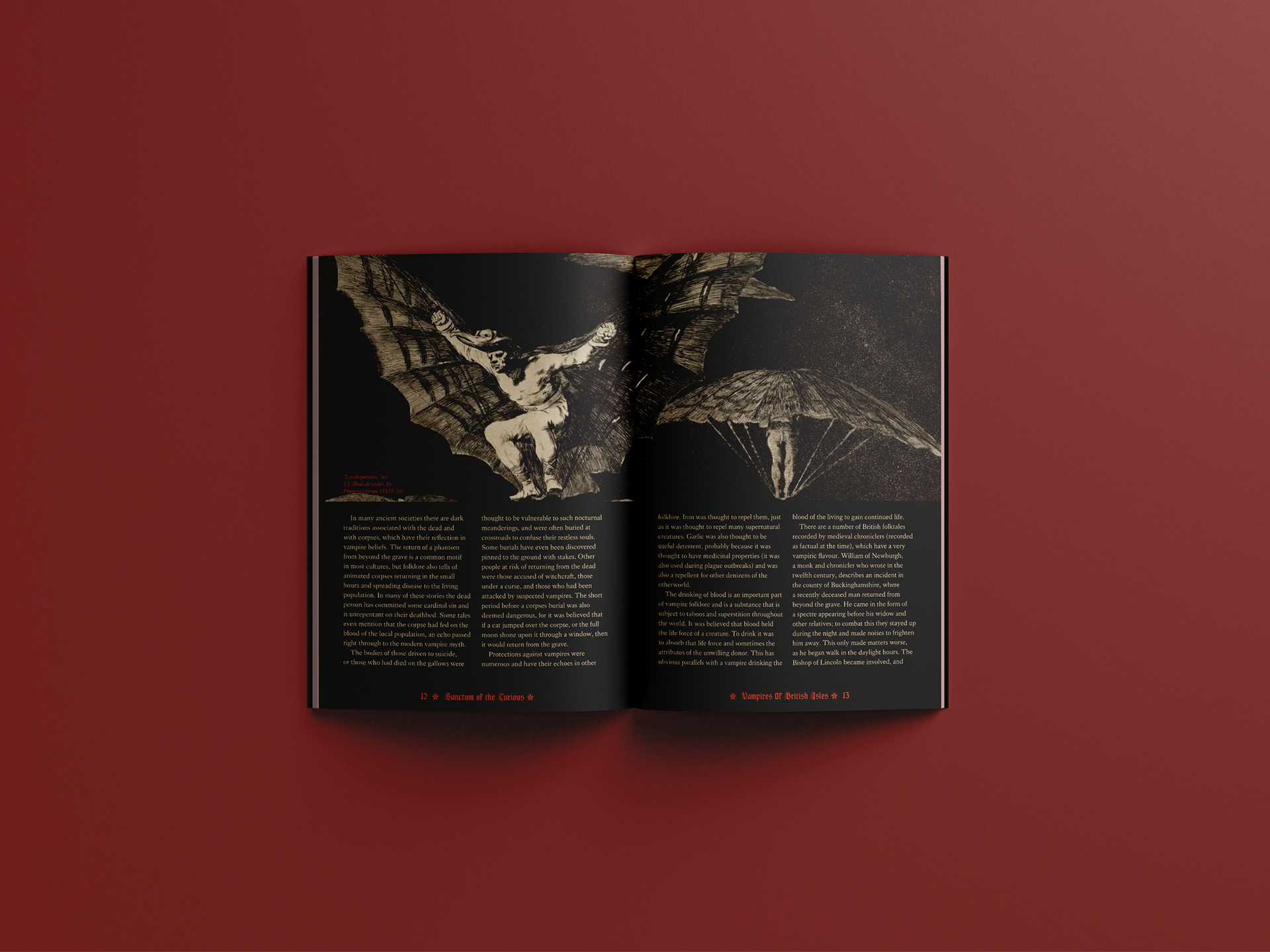
The overall theming and branding of this magazine is inspired from vintage aesthetics that can be found from the typography, woodblock engraving style illustrations to decorative elements.
Some additional vintage items that inspired the design of some spreads were:
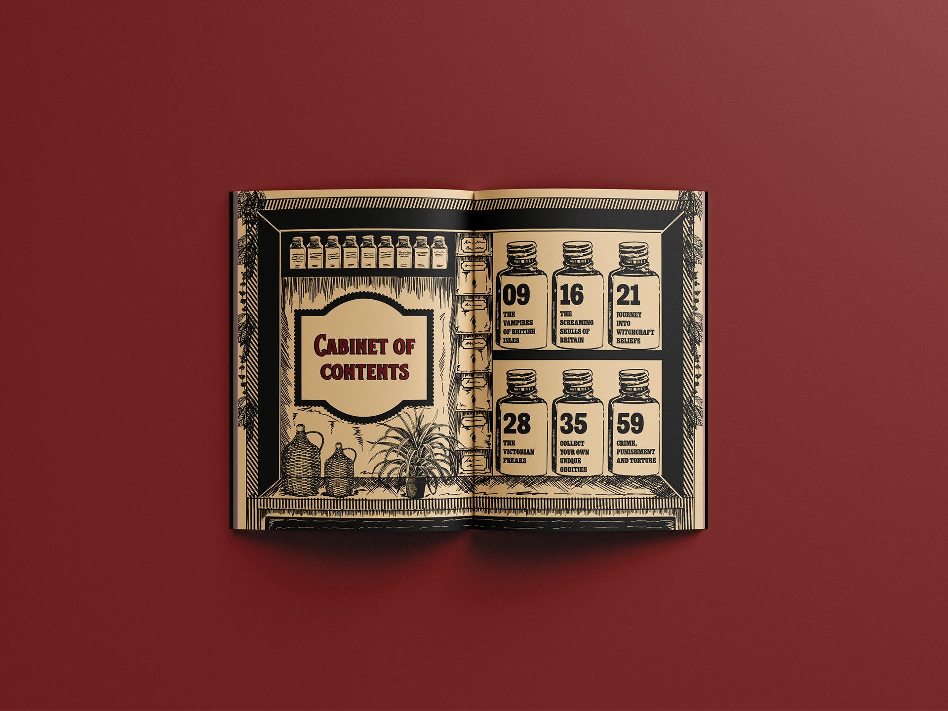
- Apothecary display cabinets: these unique cabinets inspired me to design the contents page. The cabinet also left enough space and flexibility to add more bottles if the list of articles were to increase in the magazine
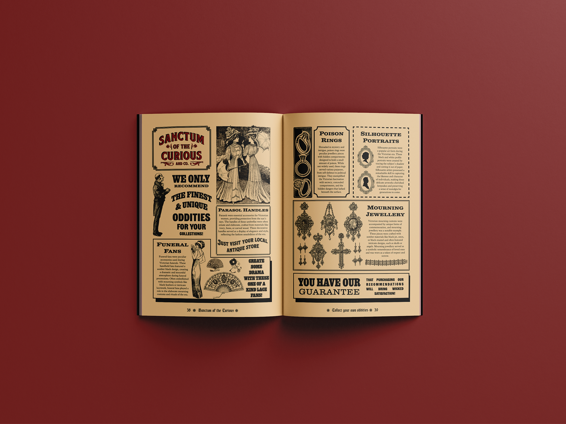
- Sears, Roebuck and Company catalogues: I wanted the listings page to look quite visually different and interesting from the rest of the magazine, allowing me to represent vintage printed media more effectively. I particularly drew heavy inspiration from the Sears catalogues (issues that were released particularly from 1890-1900) to design my listings page. This section features
slab-serif wood types such as Clarendon, which played a monumental role in printed media from 1840 onwards (especially in Europe and America’s).
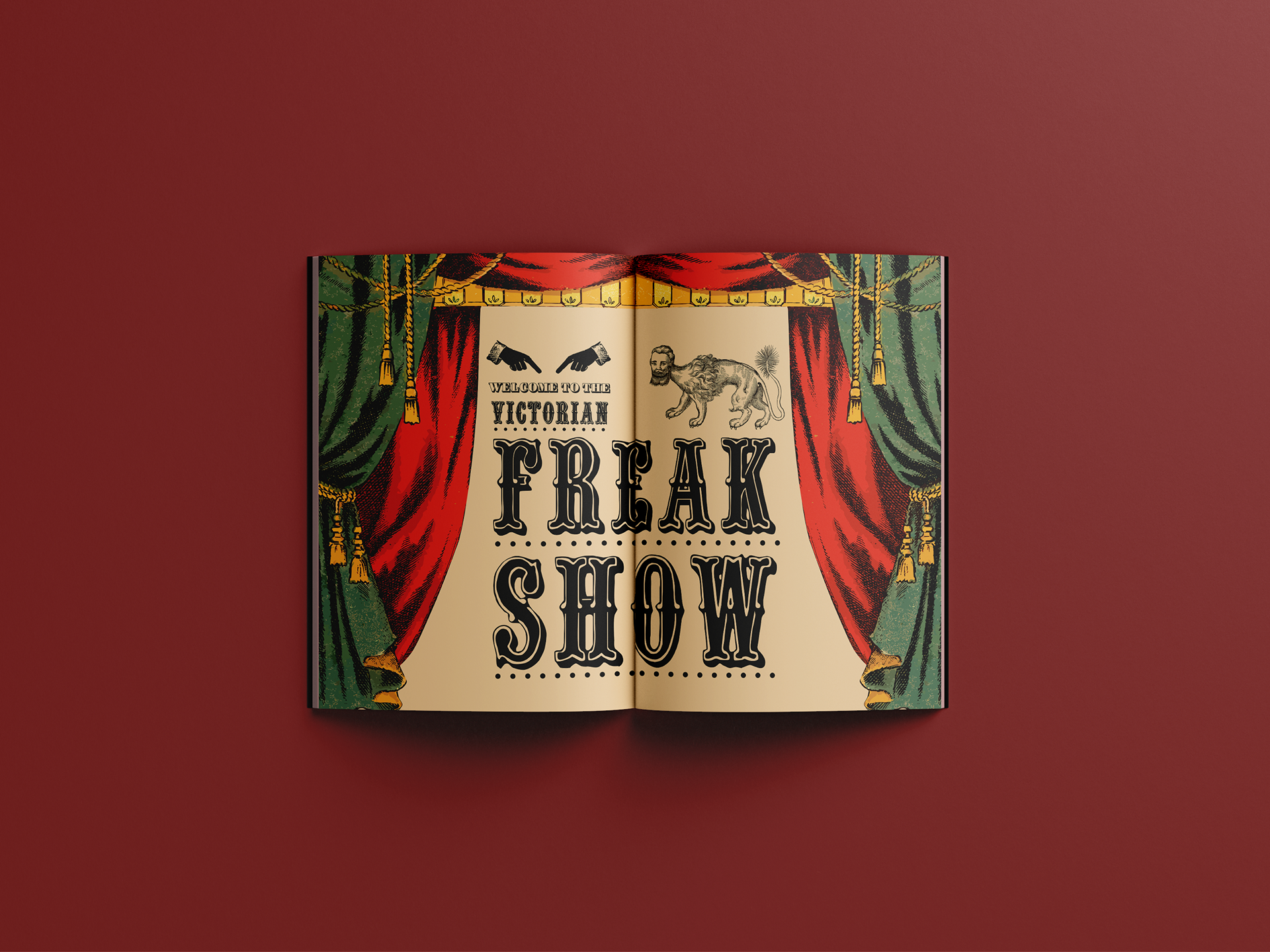
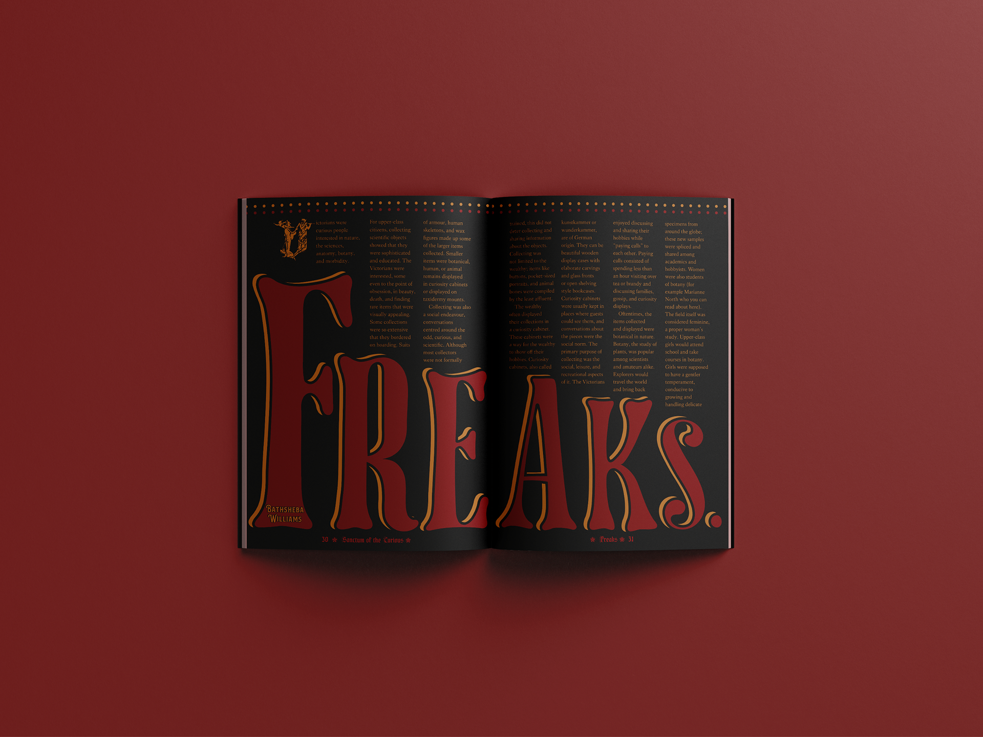
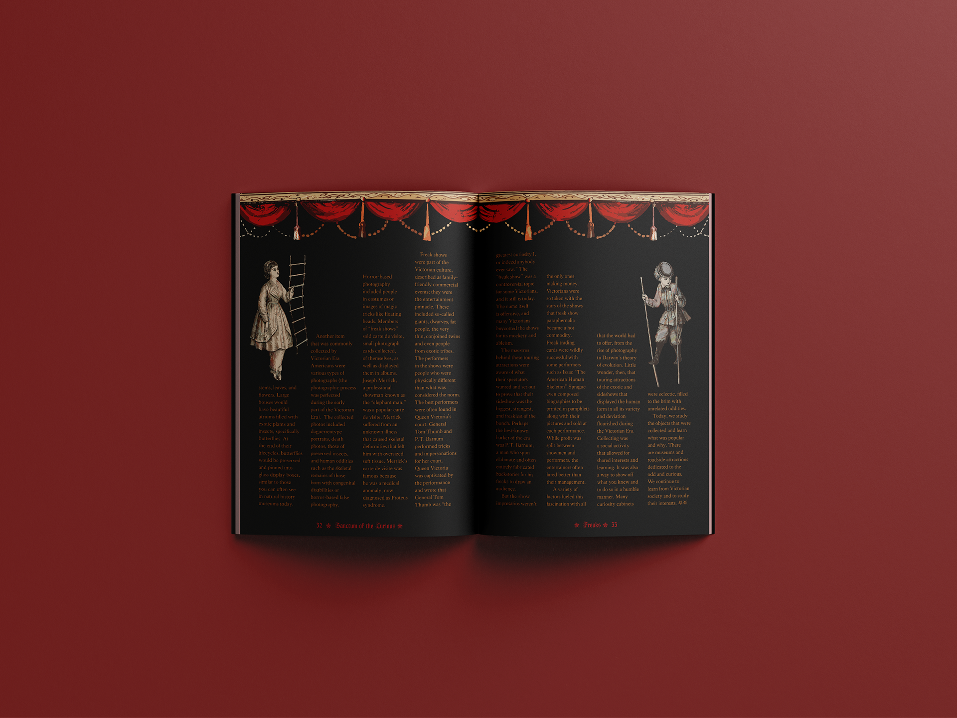
I wanted each spread of the magazine to compliment the contents of it. For instance, in the ‘Victorian freakshow’ article, I wanted to use theatrical imagery such as lush curtains and dots, to represent theatre bulbs, paired with vintage decorative and circus typefaces.
- Apothecary display cabinets: these unique cabinets inspired me to design the contents page. The cabinet also left enough space and flexibility to add more bottles if the list of articles were to increase in the magazine
- Sears, Roebuck and Company catalogues: I wanted the listings page to look quite visually different and interesting from the rest of the magazine, allowing me to represent vintage printed media more effectively. I particularly drew heavy inspiration from the Sears catalogues (issues that were released particularly from 1890-1900) to design my listings page. This section features
slab-serif wood types such as Clarendon, which played a monumental role in printed media from 1840 onwards (especially in Europe and America’s).
I wanted each spread of the magazine to compliment the contents of it. For instance, in the ‘Victorian freakshow’ article, I wanted to use theatrical imagery such as lush curtains and dots, to represent theatre bulbs, paired with vintage decorative and circus typefaces.
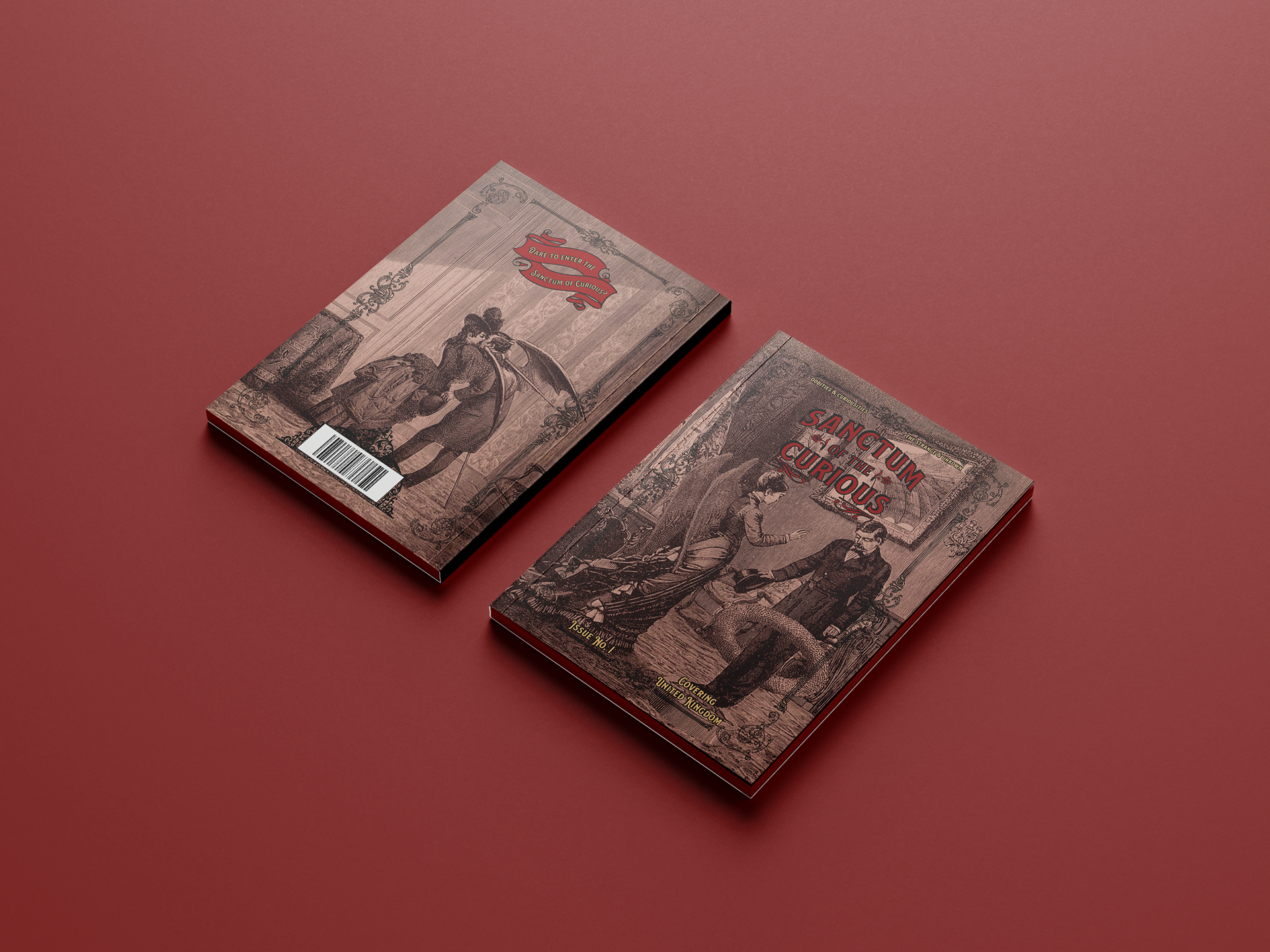
The cover series of the magazine features surrealist work of Max Ernst, from the series ‘A Week of Kindness’, both on the front and back, with a buttonhole stitch binding sewn with 0.8mm waxed thread. Buttonhole stitch binding allows for the magazine to sit flat comfortably, which was vital, considering many of the designed pages in the magazine had images and text bleeding inwards to the spine, whilst also ensuring the readers would have a comfortable reading experience.